Accuweather
App Redesign
Onboarding Screens
An expansive experience calls for a bold entrance. The onboarding screens are the app’s welcome mat, the first thing people see. They must be warm, inviting, something that beckons: come in. So it was critical to get it right. I complemented breathtaking nature photography with copy that is both compelling and instructive. I aimed for tight, taut, tantalizing language that puts the app’s benefits first. On the welcome screen, the headline is left unfinished, lending the sentence a feeling of possibility that entices the senses. The alliteration in the opening sentence of the body copy is a comfort, the rhythm propulsive. It suggests both the scope and specificity of AccuWeather’s products. The second sentence zooms in, explicitly detailing what we do and why. The CTA speaks to a literal and figurative beginning and urges the user to continue, in just 4 easy steps. Clear, direct, and concise, the remaining screens tell users exactly what they’re doing and why. This new streamlined process ensured users were more likely to complete onboarding and actually use the app. Because the weather was…fine.


Educational Content
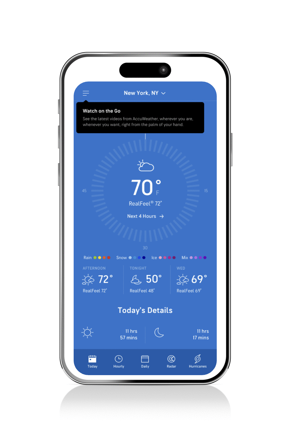
We knew that app users’ introduction to new features needed to be as rousing as the features, themselves. So we reimagined how we speak to them, visually and tonally. We redesigned the What’s New Guides, teasers found in the app’s fly out menu. Then we created new Tool Tips that point out specific aspects of the feature and Walk Throughs that offer more detailed explanation. Like the onboarding screens, the copy for all three was both compelling (exercising alliteration, repetition, puns, and word play) and instructive — because that’s the only way to learn.

.11 RELEASE: WHAT’S NEW GUIDE

.13 RELEASE: WHAT’S NEW GUIDE

.7 RELEASE: WHAT’S NEW GUIDE
.7 RELEASE: TOOL TIP
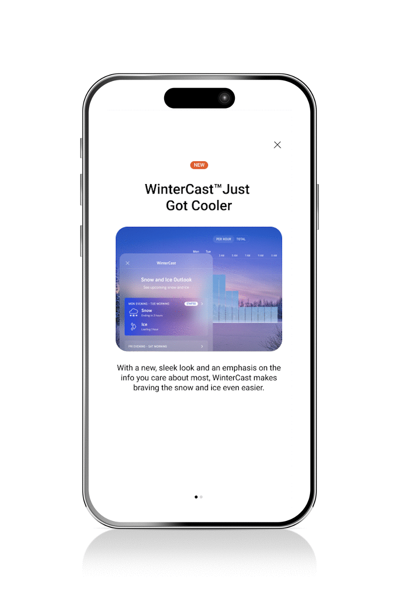
.8 RELEASE: WHAT’S NEW GUIDE

.8 RELEASE: TOOL TIP

.9 RELEASE: WHAT’S NEW GUIDE

.9 RELEASE: WALK THROUGH
App Landing Page
Besides the app store (and the upgrade screens that came later), there was no central hub, where the AccuWeather audience could learn about the app, its free features and paid subscriptions. So we made one. This landing page turns up the heat. Lush imagery, a comparison chart, video, and sizzling language clearly outline our hottest features and subscriptions.
